What editorial design can teach digital layouts
Magazines solved hierarchy, rhythm and pacing long before the web. Their lessons still make digital pages better.
Creative Pouch · · 1 min read
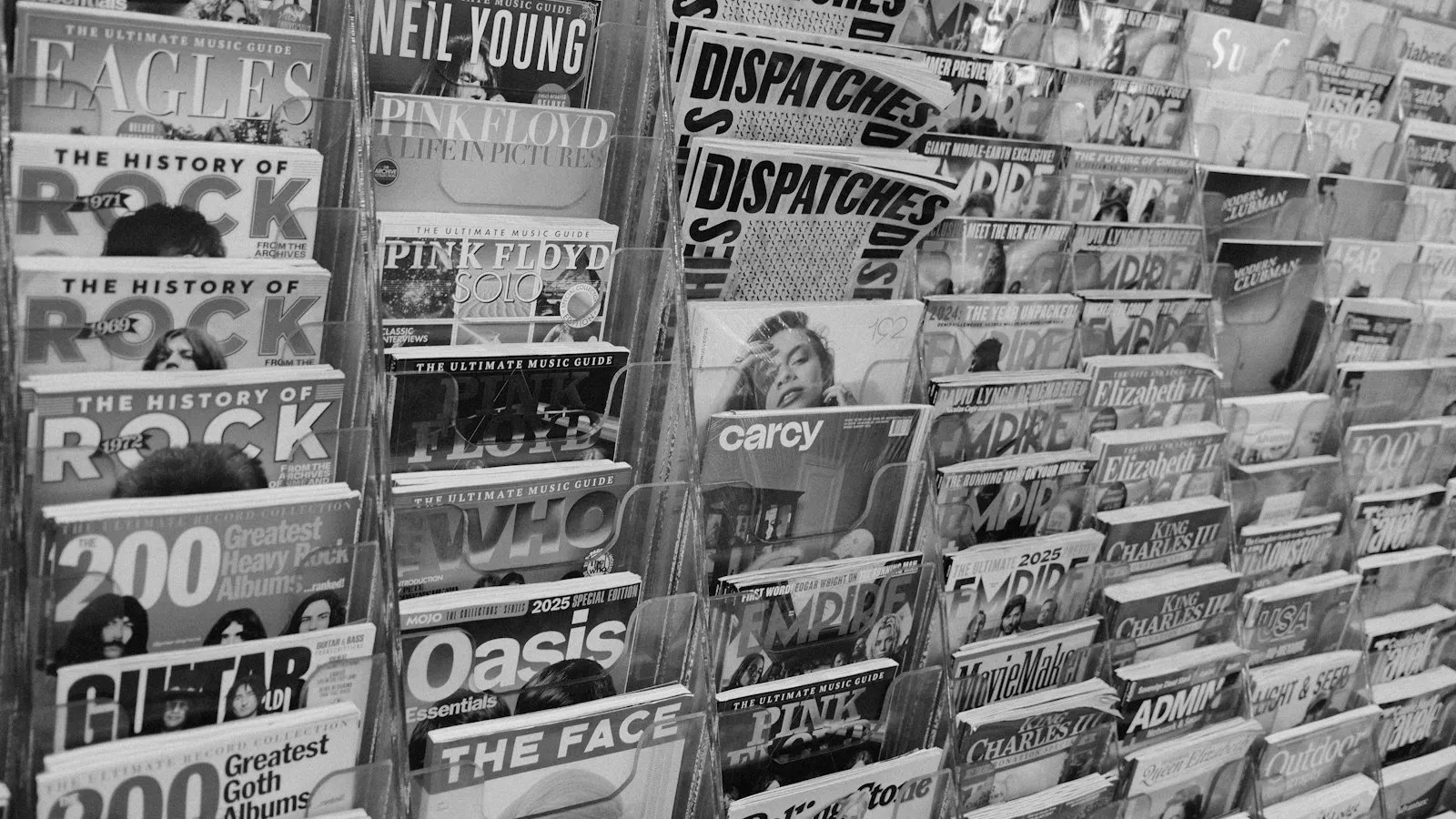
Pick up a well-designed magazine and turn the pages slowly. You’ll notice it never feels the same twice, yet it always feels like the same magazine. That balance between variety and consistency is what most websites lack.
The grid is a promise, not a cage
Editorial grids, often 6 or 12 columns, give designers a shared structure. Within it, a feature spread can be bold and a news page can be dense, and the reader still feels at home. On the web, CSS Grid makes this easier than ever.
Create a clear entry point
Every magazine page has one obvious place to start: a big image, a headline or a pull quote. Many web pages give everything equal weight, so the eye has nowhere to land. Decide what matters most and make it unmistakably bigger.
Use pacing
Magazines alternate loud and quiet pages: a full-bleed photo, then a text-heavy spread, then a page of short items. Long web pages benefit from the same rhythm. Break long articles with images, quotes and white space so readers get a rest.
Typography does the heavy lifting
Editorial designers usually work with two or three typefaces and a clear hierarchy: headline, standfirst, body, captions. Each level looks different enough that readers understand the structure without thinking about it.
Captions and details matter
Captions are some of the most-read text on a page. So are pull quotes and subheads. Treat them as content, not decoration. They’re often the hook that makes someone read the whole piece.
Break the grid on purpose
Once the structure is clear, breaking it gets noticed. An image that bleeds off the edge or a headline that overlaps a photo gets attention because everything else is aligned. Use it rarely and deliberately.
The web isn’t print. But readers’ eyes haven’t changed much, and editorial design has been studying them for a century.