Building a colour system that scales
From a handful of brand colours to a full palette with tokens, states and dark mode, without losing the brand along the way.
Creative Pouch · · 1 min read
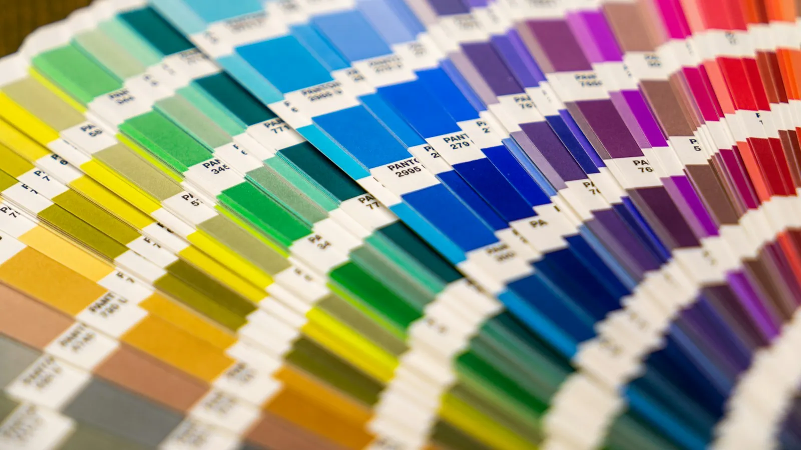
Most brands start with three or four colours. Most digital products need dozens: backgrounds, borders, text in several strengths, hover and disabled states, errors, warnings, success messages, and all of it again for dark mode.
A colour system is how you get from the first list to the second without chaos.
Build scales, not swatches
For each brand colour, create a scale of 10 to 12 steps from very light to very dark. Use a perceptual colour space like OKLCH so each step looks evenly spaced to the eye, not just in the numbers.
Name by role, not by look
Raw colours like blue-600 are the palette. What your UI uses should be semantic tokens:
background,surface,surface-raisedtext,text-muted,text-on-accentborder,border-strongaccent,danger,warning,success
Components only use semantic tokens. When you change the theme, you remap the tokens and every component follows.
Check contrast early
Body text needs a contrast ratio of at least 4.5:1 against its background. Large text and UI elements need at least 3:1. Check every text and background pair in your tokens, not just the brand colours. Fixing contrast late means redesigning screens.
Dark mode is a second theme, not an inversion
Simply flipping colours makes dark themes harsh. In dark mode:
- use dark grey surfaces, not pure black;
- show elevation with lighter surfaces instead of shadows;
- lower the saturation of accent colours a little;
- recheck every contrast pair.
Leave room for meaning
Keep red, amber and green for status. If your brand colour is red, choose a different shade for errors, or pair colour with icons and text, so meaning never depends on colour alone.
Document it
A colour system lives or dies by documentation. Show each token, what it’s for, and an example of correct and incorrect use. Future you, and every new teammate, will be grateful.