Ma, kanso, wabi-sabi: Japanese ideas for calmer design
Traditional Japanese aesthetic principles offer a useful counterweight to busy, attention-hungry interfaces.
Creative Pouch · · 1 min read
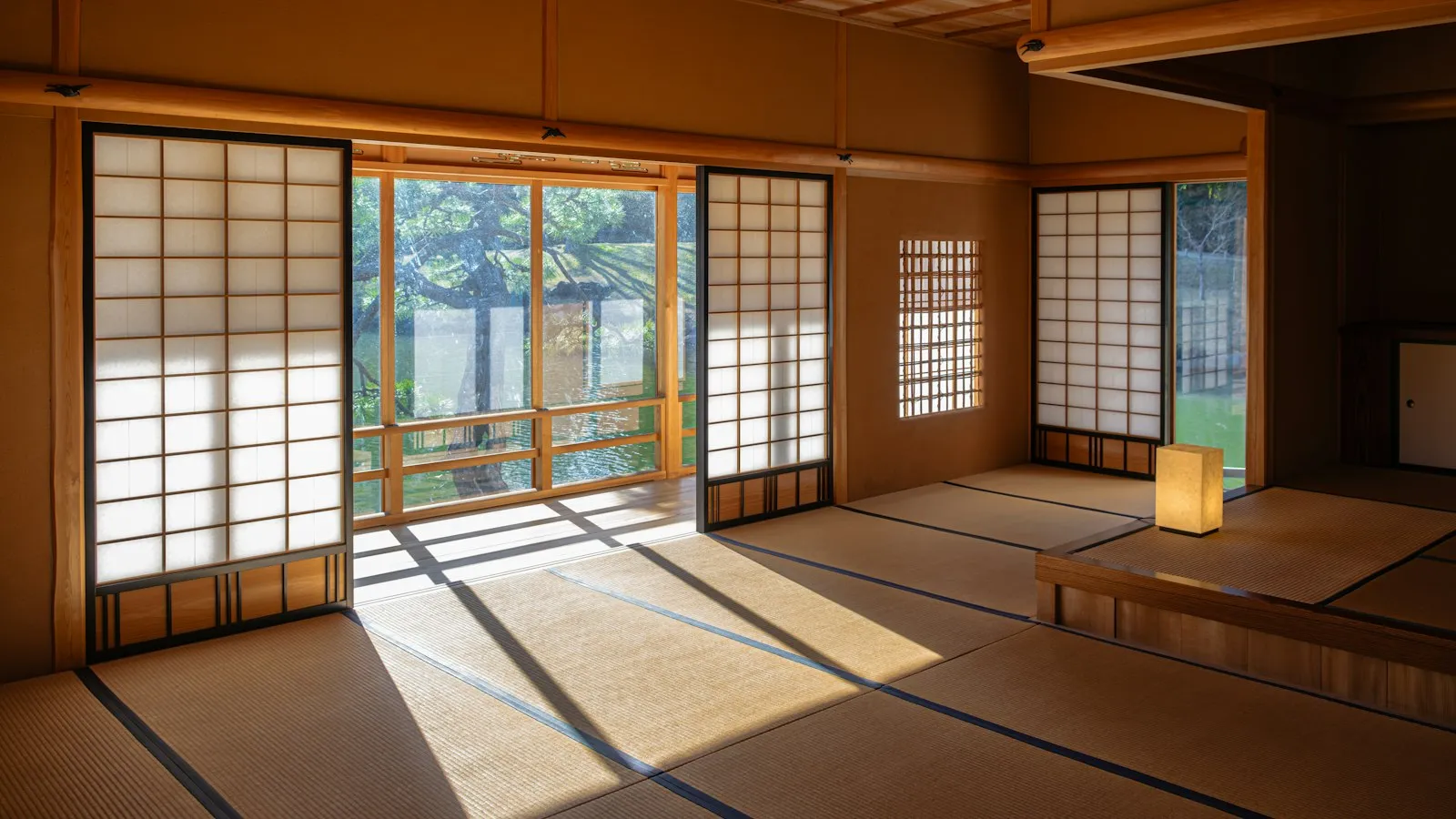
Much of today’s digital design competes for attention with notifications, badges, autoplay and endless feeds. Traditional Japanese aesthetics point in the opposite direction: toward space, simplicity and quiet confidence. A few of these ideas translate surprisingly well to screens.
Ma: the power of empty space
Ma describes the meaningful space between things: the pause in music, the gap between stones in a garden. It isn’t emptiness for its own sake. It gives what’s there room to be noticed.
In design: generous white space around key content, pauses in a long page, and not filling every slot just because it exists.
Kanso: simplicity
Kanso means removing what isn’t essential to reach clarity. It’s not about being bare. It’s about being clear.
In design: one main action per screen, fewer options in menus, and plain language.
Wabi-sabi: beauty in imperfection
Wabi-sabi finds beauty in things that are imperfect, impermanent and incomplete, like the uneven glaze of a handmade bowl.
In design: a hand-drawn illustration instead of a perfect stock image, textures and grain, and honest, human tone. In an age of flawless AI-generated imagery, a little imperfection can feel refreshingly real.
Shibui: subtle beauty
Shibui describes a quiet, understated elegance that reveals itself slowly. It’s never flashy.
In design: restrained colour palettes, small details that reward attention, and animations that are felt rather than noticed.
Seijaku: calm
Seijaku is tranquillity in the middle of activity.
In design: interfaces that don’t nag, notifications that respect people’s time, and calm loading states.
A word of care
These concepts come from a rich cultural and philosophical tradition, and they lose something when reduced to design tips. Use them as inspiration, read about their origins, and avoid using them as decorative buzzwords.